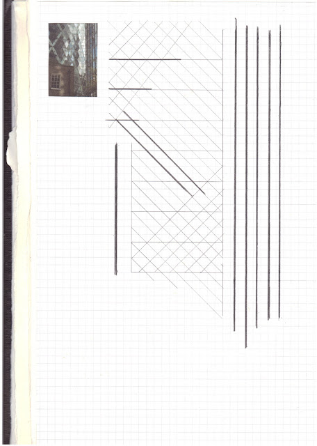
Here's some of the scans:
So this week I tried improving the Horizontal/Vertical piece by hand-drawing the buildings, scanning them and incorporating a linear system of direction. It looks much neater, the only problem I feel it might occur is fading out.
Another problem I noticed while sketching them, was the abstraction that some drawings have, others lack and that might not give it the fluent element of the previous piece.
Anyhow, I used graphite for the sketching and then applied Courier monospaced typeface as its linear structure suits my idea.


